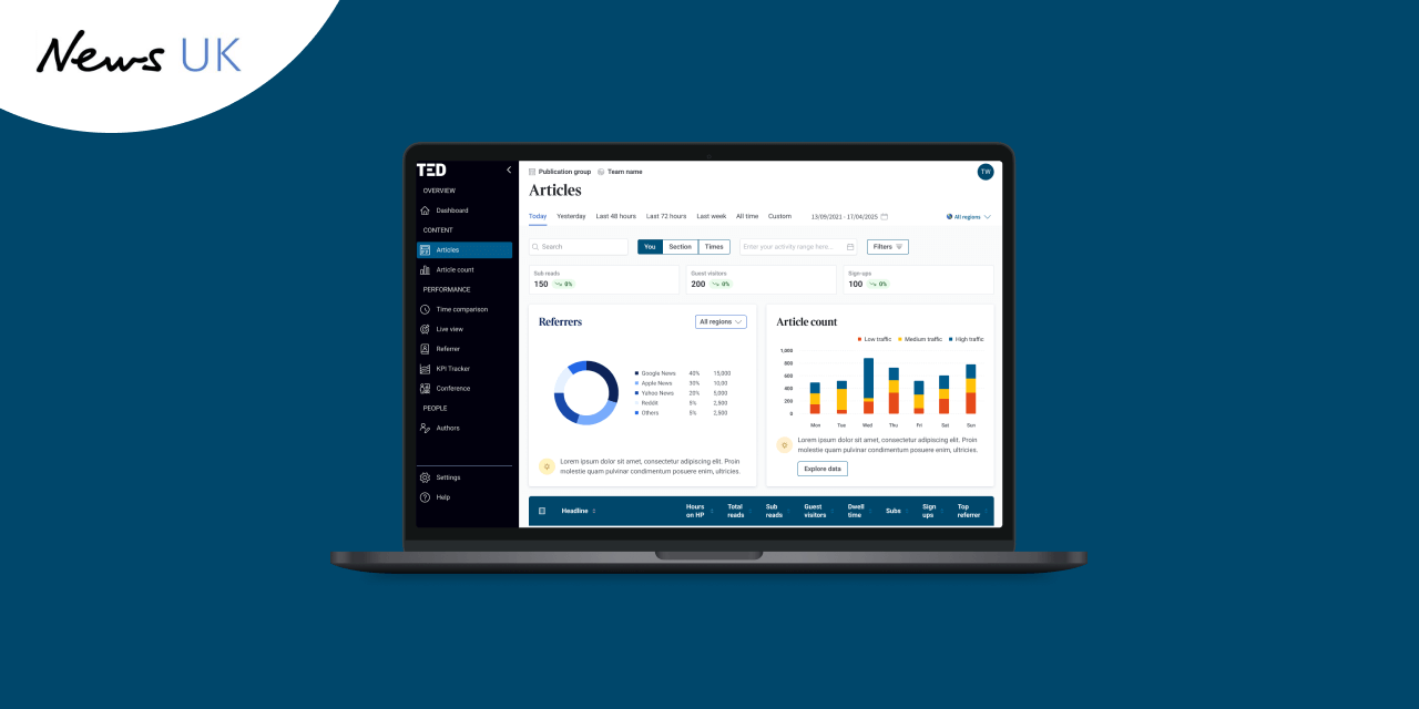
A data analytics dashboard to connect News UK to key insights faster

Once we started to work with media organisation News UK, we discovered its newsroom team members had mixed feelings about the analytics dashboard they used. On the one hand, some appreciated its depth of information. On the other, some found it overwhelming.
News UK, one of the UK’s major publishers, saw the opportunity to increase staff adoption rates of its platform, with a user-friendlier dashboard.
We were enlisted to deliver a redesign.
User-centred dashboard design for three News UK brands
News UK publishes a variety of flagship mastheads, including The Times, The Sunday Times, and The Sun.
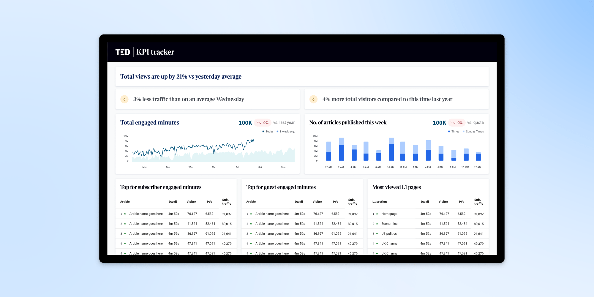
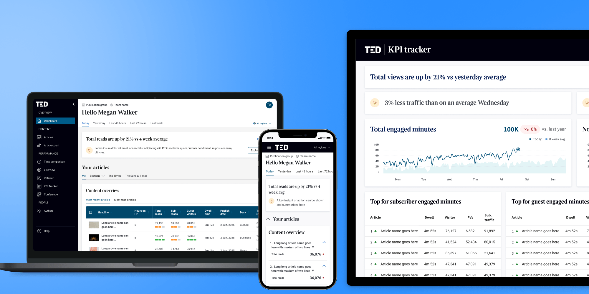
Our job was to design three analytics dashboards for two News UK news brands, The Times and The Sun, and broadcast brand talkSport, with each requiring its own branding elements, data visualisations, and business-specific metrics.
The goal was to develop a simple-to-use interface that could still avail data in as much detail as needed by News UK’s newsroom staff.
Addressing frustrations that the existing dashboard was designed by data scientists for data scientists, we focused on developing a tool that was simpler, faster, and more personalised, while still offering access to deep data insights.
“I think success was achieved when we did our last round of user testing, and a few of them (users) just said, ‘When can I get this?’” —Amaritpal Saini, Data Product Manager - Gen AI Products at News UK.
UX research and discovery inside the newsroom
Nick Simpson, our Head of UX, led our project end-to-end. He took a flight from Australia to the UK to immerse himself in the newsroom setting. This was an opportunity for Airteam and News UK to dive deep into the research and discovery phase.
It was also an opportunity for Nick to learn directly from the journalists, editors, and other newsroom end users who had a direct stake in the tool.
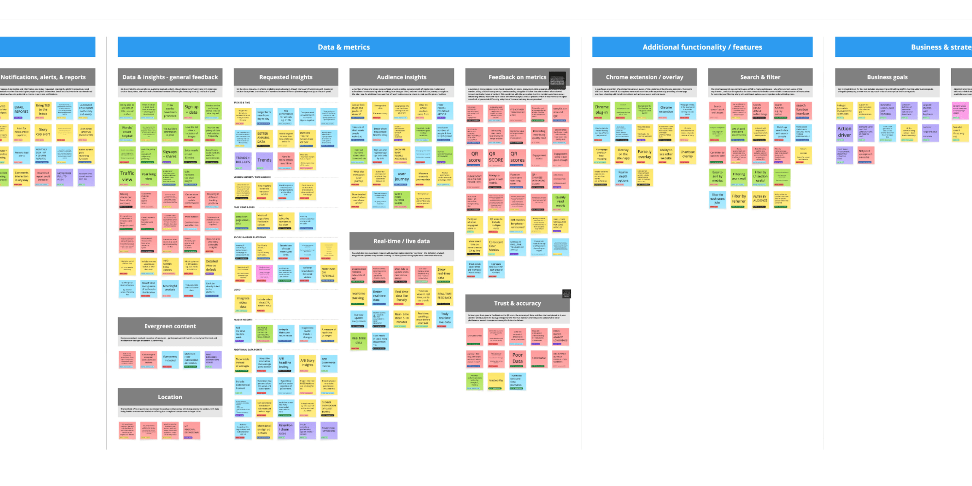
Over the course of a week, Nick embedded in the News UK offices to capture the perspectives of around 100 newsroom staffers. In that time, he delivered almost 20 workshops.
“The week on site was integral to this working, because it really gave me that immersion into how everyone worked,” says Nick. “I knew where that conference room was — that everyone rushed to every morning to see that report.
“I knew where the TV screens were placed. I knew how far away people were when they looked at them, and I met the teams and understood, not just their frustrations and how they worked, but their personalities – who they were as people.
“Forming those kind of connections with them, really helped to deeply understand who they were and what their needs were – whether spoken or not.”
Designing to improve dashboard adoption rates and loyalty in the newsroom
During the project, we worked closely with Amaritpal Saini, Data Product Manager - Gen AI Products at News UK.
Amaritpal says he was unsure about how much the newsroom staff might want to adopt the new dashboard, but he was pleasantly surprised.
“I think success was achieved when we did our last round of user testing, and a few of them just said, ‘When can I get this?’ And I think that kind of just says it, that they want it - that they want to use it now. And these are people that don't use the current tool because they find it too tricky.’”
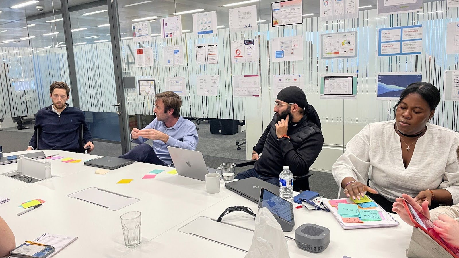
Collaborative design and iterative testing
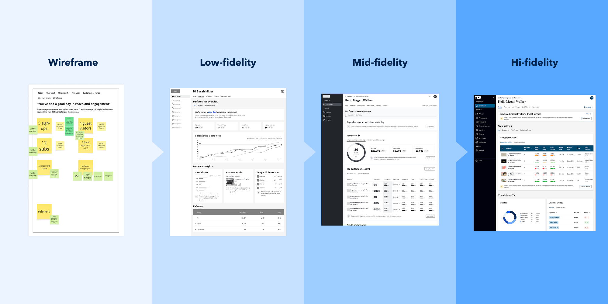
For our project design, we went through our conventional process of designing our tool in concepts of low, mid, and high- fidelity.
At low-fidelity, we sketched simple layouts and asked newsroom staff if content placement and arrangement matched with their priorities. We clarified if their priorities were reflected on the page, if they wanted anything rearranged, and if there were other things they wanted to see.
The mid-fidelity stage is where we started to prototype, so our client could click through and interact with a version that functioned for testing purposes.
In the high-fidelity phase, we produced a polished suite of screens branded for each news brand, and adapted for desktop, mobile, Chrome extension, and giant TV screens.
Informed design decisions
The time we spent in the UK was a great foundation to build off for design decisions. We coupled that experience with twice-weekly remote sessions back in Australia. This enabled us to facilitate a loop of communication, feedback, and ideas exchange that ensured the project was always progressing.
We capitalised on tools like Figma and Miro for enhanced asynchronous communication.
Nick says the time zone difference actually enabled a cadence of continual progress.
“We could put together a prototype in the day and shoot it off to them at our night time. They'd wake up to it, go and test it out with their audience, and just drop comments everywhere – and then we'd come back on, fix all the comments, and rinse and repeat.”

A multi-disciplinary team tailoring branded data dashboards
To complete our project, we put together a multi-disciplinary team. Nick led end-to-end, and our UX/UI Designer James Newton, was a powerhouse behind the design all the way. We also enlisted our Senior UX/UI Designer Paul Liddell to design The Sun, and our Lead Developer James Wyse played a role in dev consulting, drawing on his experience with the build of Australian News’ version of the data analytics dashboard.
News UK wanted 80% of the newsroom using the new tool once it was ready to roll out. The challenge for us was to make sure that it was designed well enough that real users – including journalists, editors, and analysts – could see the advantages the new tool offered over the old one, and be excited to jump in and start using it.
Each news brand had their own specific requirements that we workshopped to accommodate. We collated massive volumes of raw information from workshop participants into themes. These themes characterised what people needed from a dashboard to make data driven decisions in the newsroom.
We discovered that staff members wanted personalised dashboard experiences that showed what was relevant to them. They wanted active insights showing how things were going, and direct recommendations, rather than spending unnecessary time and energy skimming through dense information tables and making their own interpretations.
“We also learned a lot.” — Amaritpal Saini, Data ProductManager - Gen AI Products at News UK.
As fruitful as the experience was for us, Amaritpal says News UK found it beneficial too. He says the tech team learned a lot from Nick through his workshops, including his approach to information synthesis and his guidance through the design process.
“There are a lot of frameworks we learned off of him as well,” Amartipal says. “As a team, I think everyone really enjoyed working with you guys. And there's a level of expertise…. We also learned a lot from you guys…. I think even the head of UX here would agree to that.”
Future-proofed for expansion
We also provided a singular design system that enables modularity between individual dashboard designs.
Each brand under the News UK umbrella has a unified design system that their developers can maintain, scale, and evolve to meet their needs.
“It all comes back to that singular design system that we've drawn from and branded to each brand, to make sure that it's easy for their design team to upkeep firstly, and easy for devs to build from, because it all draws from the same foundation of similar components.
“It's just this consistent language that you can use across each brand.”
If you would like to learn more about our work with News UK or how we might be able to do the same for you, get in touch with our team via our contact form.