


.jpg)
If you’re still treating motion as decoration, your product’s already behind. It’s now an essential part of good UX and users expect it. When used with purpose, motion helps reduce user drop-off, improve clarity, and bring a brand to life, all without being hard to implement.
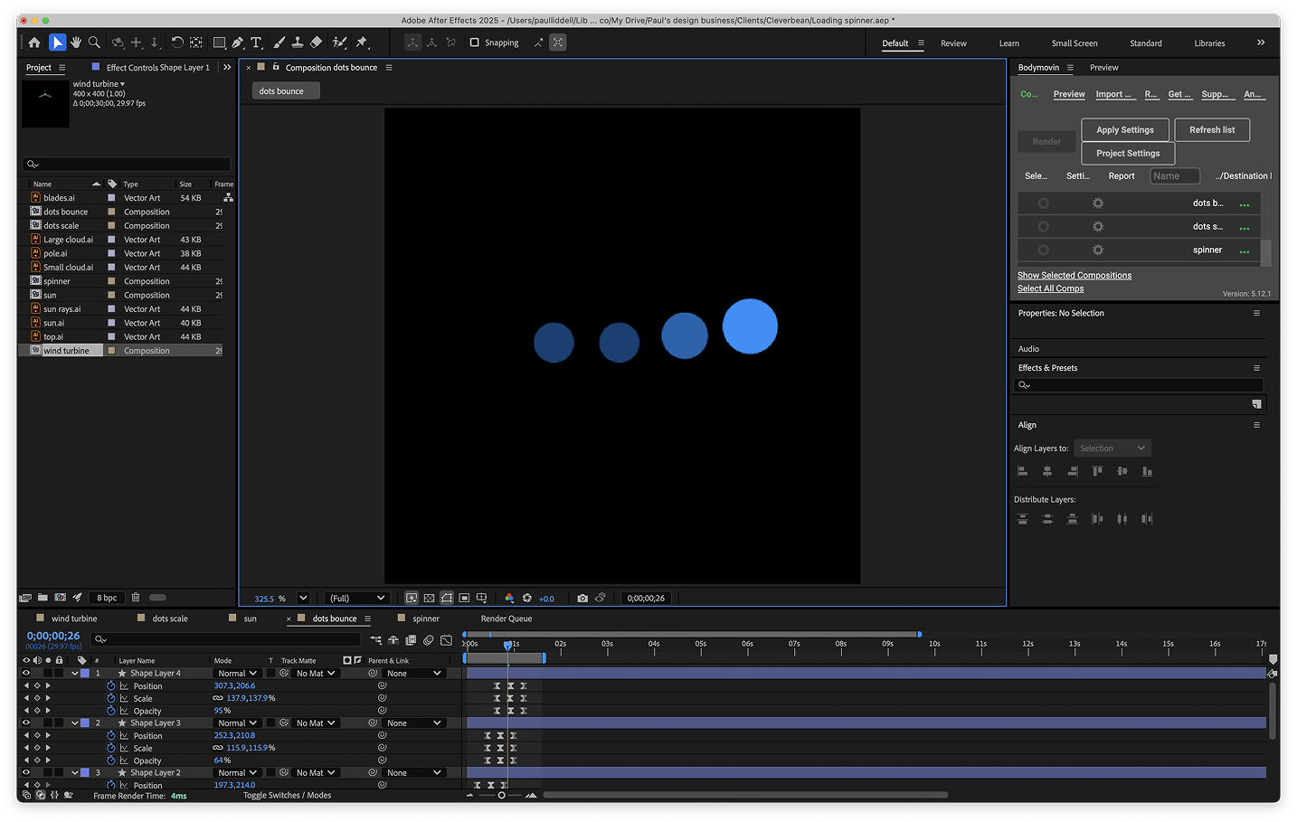
That last point is important. People often assume animation is a lot of extra work. In reality, it usually only adds a small bit of effort for a designer, and nearly none for developers. Tools like Lottie make it incredibly simple to drop lightweight animations into products with minimal performance impact. A good UX design agency should be building these capabilities into your product from the start, not bolting them on later.
The misconception: “It looks nice, but it’s not worth the effort”
One of the biggest misconceptions I hear is that animation is just visual polish. That it looks nice, but it’s not really worth the time or money. In reality, motion can make tangible impacts to real business metrics.
Yes, it needs to be done thoughtfully, but when it is, it plays a huge supporting role across a product, helping to guide users, reduce friction, and boost engagement. It also makes your product feel more intentional, more polished.
Importantly, I’m not talking about huge, complex animations. Most of the time, it’s small, subtle micro-interactions: a form confirming submission, a loading spinner that communicates progress, or a success tick after a payment. These little moments build trust and reduce confusion.
From a technical point of view, it doesn’t need to be a heavy lift. With the right tools, animations can be designed once and reused across the web and apps. For developers, it might be a five-second job to drop in.
The business case: motion delivers ROI
Motion isn’t just about making things look better. It helps your product work better, for your users and your business.
Here are a few key areas where I see motion adding real value:
1. Reduced drop-off during wait times
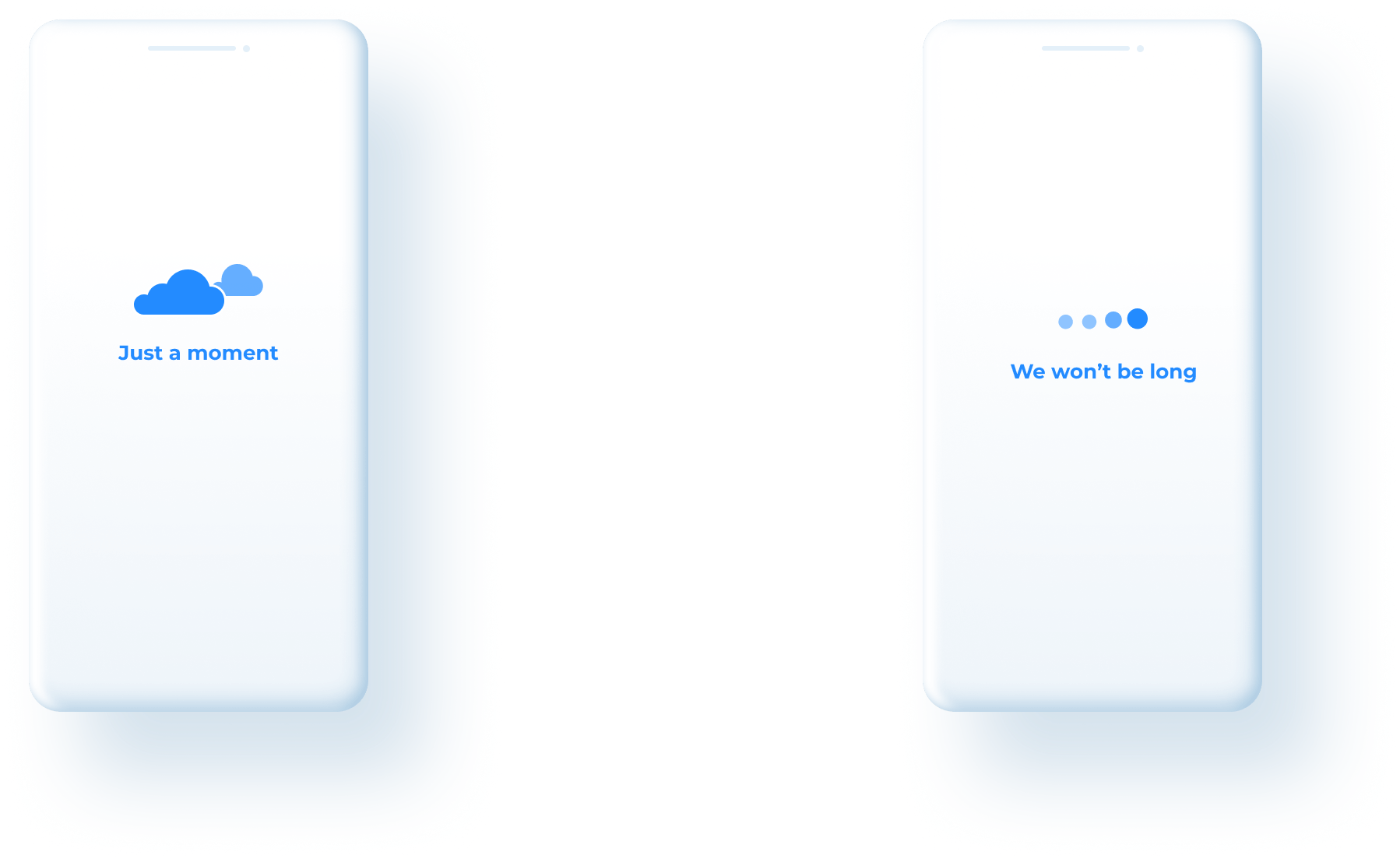
This is one of the clearest use cases. If a user is stuck waiting for something to load or process, they’re likely to assume the app is broken and abandon the task. Adding a short, branded animation during that pause keeps them engaged and informed.
Animations that reflect the brand or tell a short narrative are perceived to load faster, even when all the animations are exactly five seconds long. Users rate these animations as more aesthetically pleasing and emotionally engaging and perceive them as up to a full second shorter than abstract loading indicators like spinners or progress bars.
2. Creating a more polished first impression
Motion signals care and attention to detail. In industries like finance and healthcare, that perceived polish matters. It helps build trust, especially in moments where users are entering personal data or making transactions.
3. Helping users learn faster
If you’re relying solely on static interfaces to teach users, you’re missing an opportunity. Motion is one of the most effective and underused ways to guide and educate. It makes onboarding easier, reduces cognitive load, and improves first-time success.
Well-designed motion doesn’t just look good it improves usability. Studies show that motion can reduce cognitive load by helping users process complex interactions more easily, and enhances task performance by guiding attention and reinforcing relationships between elements. Motion also contributes to stronger emotional engagement, which in turn supports better memory and learning particularly useful during onboarding or when introducing new features.
4. Giving feedback and reassurance
Little things, like a button that gives feedback or a progress animation, might not seem like much, but they help users feel reassured. They know something’s happening, and they’re not stuck. It’s a big part of making digital experiences feel responsive and smooth.
5. Balancing accessibility and perceived speed
Motion also helps with perceived speed. Even if something takes time in the backend, thoughtful animation can make it feel faster. Animations with a moderate pace, not too fast, not too slow make wait times feel shorter and the experience smoother. When motion is paced well, it grabs attention just enough to distract from the wait, without becoming overwhelming or annoying.
And with the right design approach, it’s easy to make sure motion meets accessibility needs too, including giving users the option to turn it off if needed.
Where motion makes sense
Motion isn’t there to steal the show but if it’s not actively improving the user experience, it shouldn’t be there at all. It needs to support the experience, not slow it down. When done right, users don’t even notice motion, they just feel like the product flows better.
A UX design agency with motion expertise can help identify exactly where these moments will have the biggest impact.
Some high-impact areas to use motion include:
- Loading states: soften long wait times and reduce drop-off
- Onboarding: set expectations, reinforce brand, help orient users
- Confirmations: provide reassurance and closure (e.g. payment success)
- Teaching moments: guide gestures or new features
- Brand moments: quick animations to create delight and build identity
Common mistakes to avoid
Motion can go wrong if it's not handled carefully.
Some of the most common issues I see include:
- Using motion just for decoration: Animation should always serve a purpose, not just be there for the sake of it.
- Trying to do too much, too early: Start with solid UX, then layer motion in to support it.
- Not thinking about accessibility: Motion should always be optional and never cause discomfort.
- Overestimating dev effort: Some custom animations are tricky, but most micro-animations can be implemented quickly with the right tools.
- Lack of consistency: Without a shared motion system, animations across a product can feel disconnected.
Getting these things right means motion becomes a natural part of the experience, not a distraction.
What a UX design agency brings to motion design
Good motion design isn’t about doing more. It’s about knowing where and how to apply it. It’s not something every team considers by default, but it should be. Not every designer has motion in their toolkit, it’s still a bit of a rarity outside of the big players. That’s why having a UX design agency like Airteam, where motion is part of the process, can help set your product apart.
To do it well means:
- Understanding what the user needs in each moment
- Making sure animations are purposeful and short
- Designing with accessibility and performance in mind
- Using the right tools for the job (like Lottie or native transitions)
Final thoughts: it’s not just aesthetic, it’s strategic
Motion isn’t about being flashy. When it’s done well, users barely notice it. They just feel more confident, more guided, and more connected to the product. It’s like adding the right amount of salt and pepper, when you get it right, everything just works better. When you leave it out, things can feel a bit flat.
The beauty of it is that it doesn’t have to be expensive or complicated to do. With the right approach, motion becomes a low-effort, high-impact addition to any product. It makes things clearer. It reduces frustration. It makes brands feel more alive.
Uplift your software with motion
Looking to add motion to your digital product? Whether you’re starting fresh or want to improve an existing platform, we can help you do it with purpose. Get in touch via our contact form or email us at hello@airteam.com.au.

Related posts


Australia's trusted software development partner


