Introducing Airteam rebranded: the story behind our new brand identity.
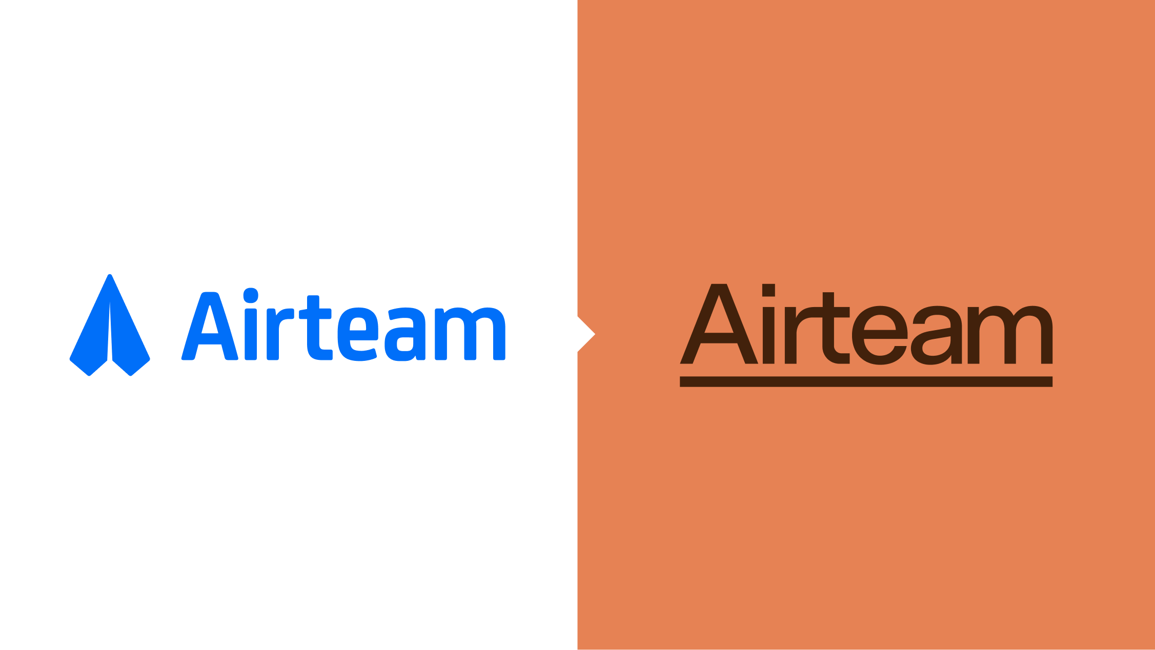
Our new brand is an updated reflection of who we are, 10 years on.
It's our 10th birthday this year.
10 years is rather a long time in the world of technology - and naturally things have changed and shifted along the course of Airteam’s lifespan.
We've grown in new directions, and, perhaps more importantly, we've solidified into the things that make us ‘us’. So, it felt like it was about the right time to reflect those changes back to the world in a way that would more effectively encapsulate who we are today versus who we were 10 years ago.
Our previous logo, the little blue paper plane, was part of the Airteam brand identity for almost as long as we had an identity. All the time the logo stayed the same, however, the world it lived in was changing. The little paper plane was quickly mainstreaming as the ubiquitous icon for instantaneous messaging on social media and communication apps.
The story that used to accompany this logo was that we would ‘fly in’ a team of digital experts, solve client problems, and fly back out again - on to the next project. This is an operating model that's changed somewhat over the years - we've shifted from our ‘fly in fly out’ approach to one that focuses more on longer-term partnerships, and we've tightened our problem-solving to specialise in complex problems within regulated environments.
If you want to rebrand, you really need to know exactly who you are.
The process - understanding who Airteam really is
If you want to rebrand, you really need to know exactly who you are.
Patrick, our co-founder and Executive Director - Commercial, had already started this process last year, publishing the results in a post, What I learned from 35 conversations about Airteam.
He had reached out to current clients, previous clients, ‘almost clients’, and other companies, to understand where our team was adding the most value, and where it could build on the values that it offered.
The core takeaways:
- We were adding value to clients, but there were areas where we were losing visibility: clients for example often weren't aware of the full range of services that we offered.
- We are excellent at solving complex problems.
- Our expertise in regulated industries, backed by our ISO27001 and 9001 certifications, gave clients peace of mind that we can deliver software that isn’t just usable and functional, but secure.
- We have experience and expertise, awards, industry credentials, and client testimony that all underscores we are good at what we do.
- In an industry like software, which is full of terms that can be overwhelming for people who are unfamiliar with the industry, it helps to have the maturity to be able to lead companies through what can sometimes look like a complex process to people who are new to these scenarios.
One of the signature characteristics of our team is that we really commit craft, effort, and care into what we produce.
From this research we started to realise that there were more effective ways to talk about ourselves, and to talk to our clients.
Establishing a new voice
Creative agency Bounce played a big part in giving us clarity here. We participated in strategic exercises with them to identify our market position, and crystallise what our differentiators are.
Bounce helped us establish a brand position that informed the tone of voice guidelines we then developed internally. With a clear sense of who Airteam is, how we talk as a brand and business, and how we want to be perceived.
We wanted our branding to help make the process of collaborating with Airteam feel easy. To take the weight off the client having to know all of these nuances and complexities and bring them something crafted to their needs.
It doesn't need to be so hard.
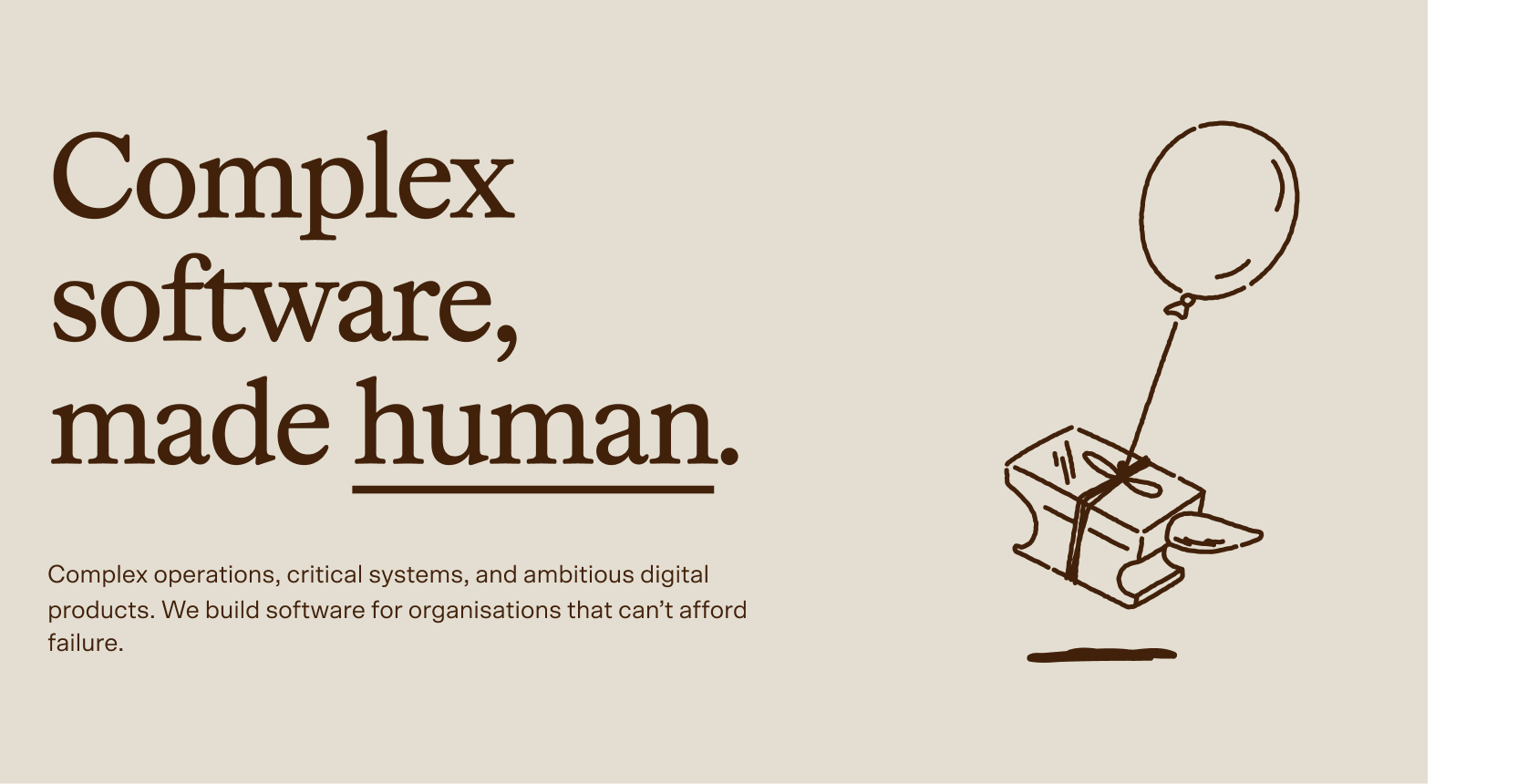
So, our core output from Bounce was our new tagline:
Complex software, made human.
The reject pile
Ideas that were left on the cutting room floor:
- Leaning further into ‘air’ analogies - “we make software soar”
- “Tech punk” - radical new visuals invoking pixellated designs, graffiti-culture inspiration, and ironic imagery.
- Balancing complex and human - we discarded some ideas that were beautifully crafted but sat too deeply within one or the other.
- A new name. We considered renaming, but felt that Airteam suited us too well, and was too well-entrenched.
Adding the aesthetic
With our strategic position clarified, and our tone of voice locked in, we had our foundation to base a visual identity against: an aesthetic which evokes the scientific.
There was a moment where it just kind of clicked - we realised as a team that the work we really love doing is quite scientific in nature, often for quite scientific clients: it involves research, and hypotheses, and testing before building something that suits the right purpose. Once we’d said it out loud, it was like this direction had been there the whole time, we just needed to step back and ‘see’ it.
With that direction in mind, we got to work pulling together some key inspirations (a lot of which were based on scientific journals and publications), and we reached out to Alter to help us hone these ideas into a visual identity.
The right time, the right brief
We had originally spoken to Alter at the start of the rebrand process, before we’d really clarified who we were at 10 years old. Jonathan Wallace, Director at Alter, said to us originally that our request just sounded like “help us, we don’t know what to do”.
6 months later, we knew we were ready. We came armed with our market position, tone of voice, and specific visual inspiration. We had the anchor points and parameters in which a visual identify could be formed.
Alter led us through a series of visual explorations, which honed us in on a new aesthetic that shows a depth and maturity to the way that we operate, and highlights our key differentiators:
We build software, but we do more than that.
We also research what's happening in the industry, where trends are moving, and how people are responding to change. Through that, we can back up our decisions or rationales for what we do, and help clients find new and interesting directions to take their technology, and to understand its impacts.
Alter really helped us to narrow into that aesthetic, to bring it to life from a visual perspective.
We continue to love communication and collaboration. The team ethos we bring to projects, which clients appreciate, is as strong as ever.
The new brand, and what it means
The new brand emphases a ‘lightness’ - the relief that comes from solving heavy, complex problems.
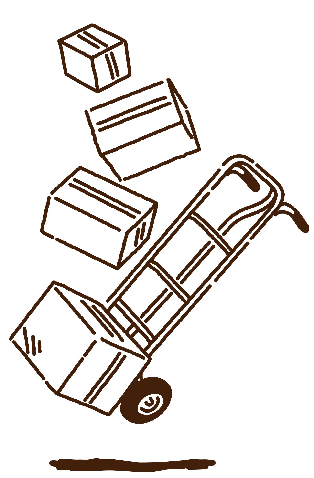
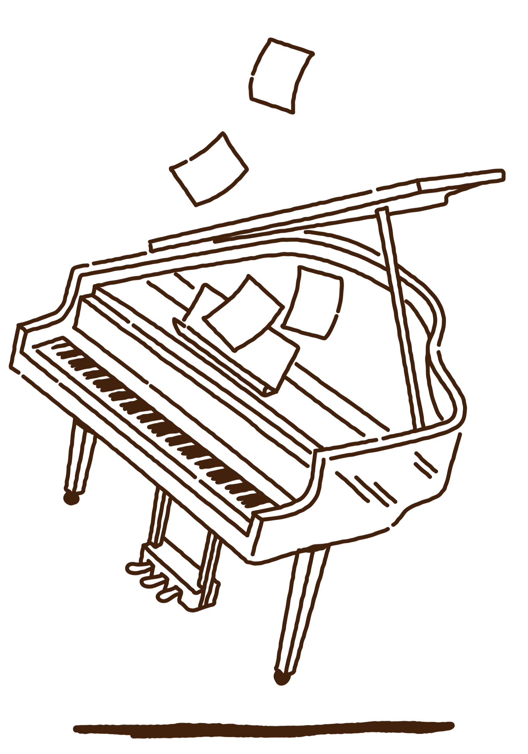
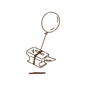
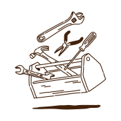
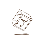
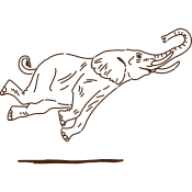
The simple concept of an underline doubles as a shadow, which is reflected in our illustrations as a shadow beneath floating elements.
Airteam’s way of working remains intact. The rebrand strengthens our position in this regard. It’s an opportunity to remember the strengths we have and lean into these.
We continue to love communication and collaboration. The team ethos we bring to projects, which clients appreciate, is as strong as ever.
We continue to focus on providing bespoke solutions to complex business problems that we solve with craft and care. We deliver certified security and quality management, and we’re fully Australian based (we don’t offshore anything).
We've got rigorously audited certifications, we're following standards and guidelines and procedures to ensure everything we build is secure and will stand the test of time.
And underpinning everything is just our love of what we do; creating meaningful software that has an impact on the people that use it in a positive way.
The logo
Our name, defined as our core brand element. A custom ligature unites the 'r' and the 't', linking the 'air' and 'team'. The underline showcases the core story of floating - showing how Airteam can lighten your load, and shoulder complexity.
Colour
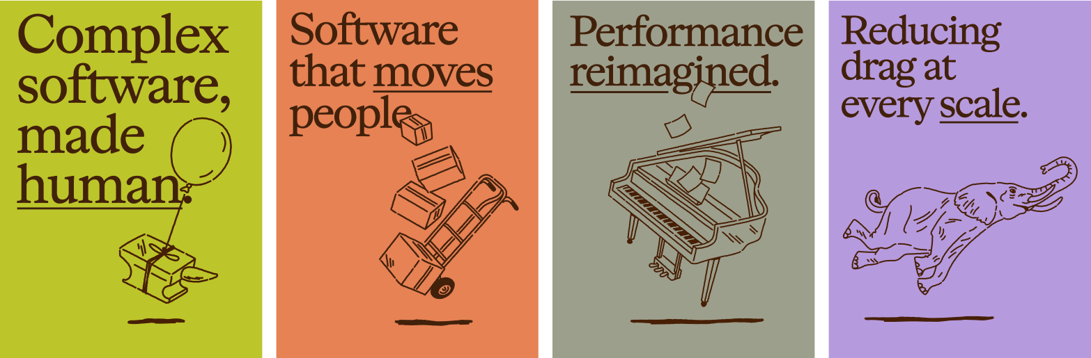
We've leaned heavily away from our previous blue into warm and grounded colours, drawing a parallel to our tone of voice, and the way in which we like to work and collaborate. Dusky orange, green, and purple are underscored by a deep brown and backed by a warm 'parchment' background. This applies to our imagery too - we've edited our team photos to have a warmer hue, softening them and giving them a more friendly feel.
Typography
OttoScto mediumScto regularContemporary, balanced, friendly, and smart. We wanted typography that felt memorable and distinct - hence the serif font Otto, paired with a sharp and readable sans-serif, Scto. These fonts reference the authority and maturity of the scientific, and embody our authority as industry experts.
Illustrations
Taking the 'analogue' and 'heavy' and making them light, our illustrations don't try to literally represent software or how we build it, but focus more on the feelings and results of doing so. Their bespoke and hand-drawn nature parallels the way in which we work - celebrating human craft and thoughtfulness.
Conclusion
One of the biggest satisfactions for Airteam now is the sense that the rebrand feels like us.
Previously, it felt like we'd outgrown the clothes that we were in. We've now changed to a new outfit that we feel suits us better than the old one.
That coming through, and the fact that this expands upon and reinforces what we knew we were good at is the thing that we're really celebrating - this is what we're really specialists at; this is where we find the most joy in the work we do.
Software development can feel complicated. But it doesn’t have to be.